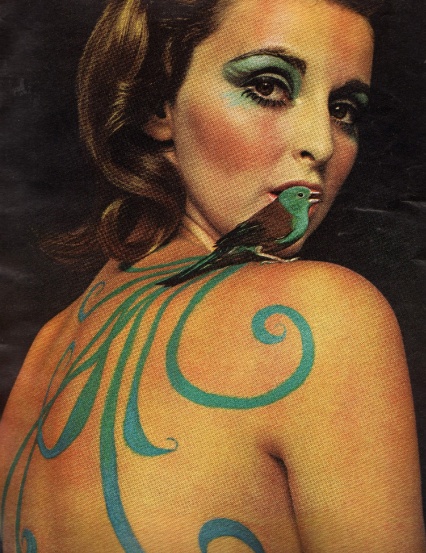
You probably think this fabulous ’60s image is a page out of Vogue (“Makeup design by Giorgio di Sant’ Angelo” reads the credit!) but it’s from a magazine I found recently at my mother’s house, the November 1967 issue of McCall’s. The beauty story is “Feather Fantasies” and the issue also includes the debut of Truman Capote’s short story “The Thanksgiving Visitor” (his follow-up to the classic “A Christmas Memory”) and an accompanying interview of Capote by Gloria Steinem, with his portrait by Avedon splashed across a page and a half of the once-standard oversize magazine (before postal regulations of the ’70s shrunk everything).
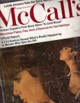 In those days, McCall’s was the glamour girl of the “Seven Sisters” magazines – including Good Housekeeping, Redbook and Ladies’ Home Journal – aimed at the suburban wife, and enormously successful. (At their ’70s peak, the “Sisters” combined circulation was a staggering 45 million!) The McCall’s issue is an unbelievable time capsule, including the topical – a survey of doctors about the Pill (just six years old), then-First-Daughter Lynda Johnson’s tale of her engagement, a heartbreaking photo essay about a mining tragedy in Wales – amid the fashion and beauty stories and pages and pages and pages of holiday entertaining recipes, from cheese puffs and toasted anchovy rolls to candied grapefruit baskets (for gifts!) and three different and rather involved fruitcakes.
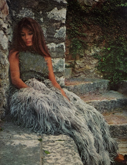
Whether intentional or not, the avian theme continues in a fashion photo of the actress Anouk Aimee, just after A Man and a Woman catapulted her to fame, in a Donald Brooks gown of guinea hen and ostrich feathers. She’s exulted as a “Real-Woman” – hyphenated – (“All else about this classically-boned, chestnut-maned enchantress is this-moment-real”) along with cover girl Marisa Mell, a now obscure ’60s bombshell (in the era of Ursula Andress and Virna Lisi), who was about to storm Broadway in a David Merrick musical version of, I swear, Mata Hari, directed by Vincente Minnelli (Liza’s dad, of course, and apparently the overproduced $800,000 vehicle flopped out-of-town in Washington and so there was no storming). Mell seems an odd cover choice for housewives in Denver and Detroit, from her “Real-Woman measurements, 38-24-38” (shades of Mad Men’s Joan), but she reels (reals?) them in at the end: “Sex? Her ideas are both contemporary and ancient. ‘A Real-Woman doesn’t want sexual freedom; she wants to belong to a man. Men should stop the big hunt after business and money. Life is the important thing. Human beings are the miracles.’ Marvelous, miraculous Marisa.” Unfortunately my scanner is not big enough to relay the 14-inch high page of marvelous, miraculous Marisa in her floor-length fox and cheetah fur coat.
But wait, there’s more. After our proverbial homemaker has painted her eyelids like feathers, swallowed her Pill, relaxed with the new Capote fiction, zipped up her dinner gown and finished baking a batch of Fig Bonbons, she still has to have something to talk about – like the new music. McCall’s comes to the rescue with “How Not to Flop at Pop” with now cringe-worthy advice: “Don’t say. ‘it’s very pretty.’ Say things like, ‘It should go high on the charts,’ or ‘It turns me on.’ “
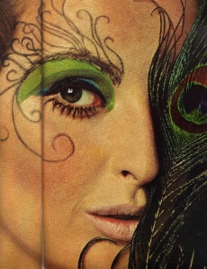
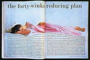
One of the most amazing things is that nearly every photograph in the issue – from Marisa to the miners, from the eye shadow to the eggnog pie – was taken by the magazine’s art director, Otto Storch. Renowned in art direction history as part of the “New York School” of the ’50s and ’60s, he was a disciple of Harper’s Bazaar’s legendary Alexey Brodovitch, and helped  revolutionize magazine design by integrating all the elements of a layout – headlines, text and photography – in his designs, often by twisting and manipulating type in this pre-computer era – as in his famed “forty-winks” layout. By 1967, Storch was nearing the end of his career at McCall’s – after two editors and with a 6-million circulation, TPTB veered more conservative as money men invariably do once something is a success – and he seamlessly moved into a full-time and lucrative career as an ad photographer for American Express, Volkswagen and others. Storch died in 1999, at age 86, and by then the magazine was on its last legs – if you don’t remember, it was sold in 2000 and Rosie O’Donnell became editorial director. Relaunched as Rosie, it tanked in 2002 amid lawsuits and widely reported infighting. The Golden Age of magazines, and McCall’s ‘’60s gloss and glamour were long gone by then.
